
Navigator
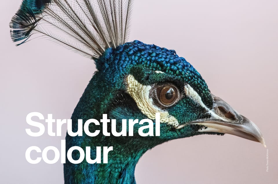
As we continue to strive for a more circular economy in the design world, could nature hold the answer to sustainable alternatives for pigments and dyes when considering colour application? Here, we discuss the natural phenomenon of structural colour and a biomimetic approach to design.
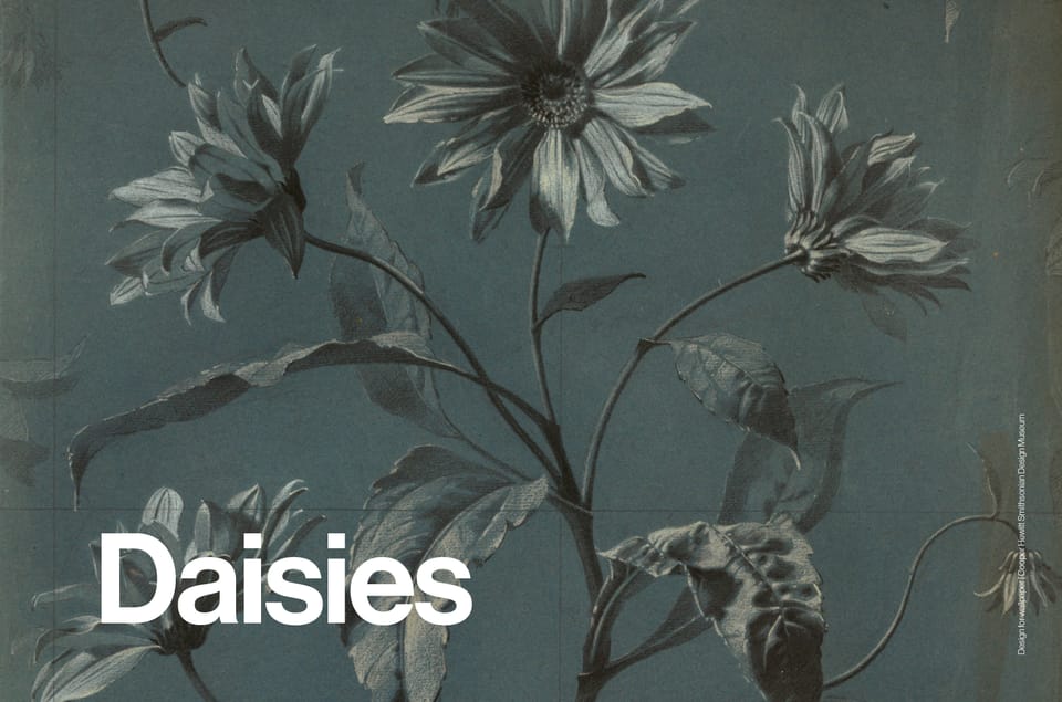
A symbol of youth and optimism, the daisy motif resurfaces across fashion and design, from vintage-inspired prints to nostalgic homages to Mary Quant’s iconic 1960s aesthetic.
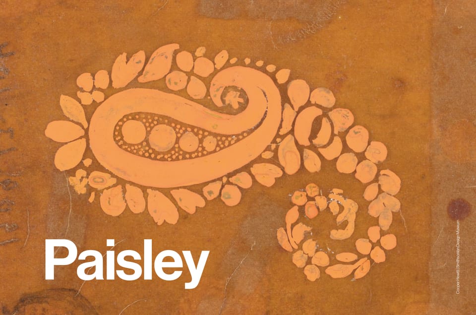
Paisley’s long history, from Persian symbolism to 1960s psychedelia, resurfaces in fashion and interiors. Dior, Gucci and Etro reinterpret the motif, balancing nostalgia with new relevance.
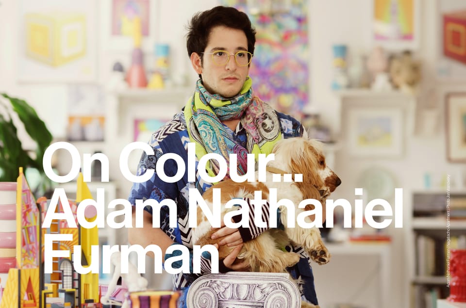
Bold colour, intuitive palettes and influences spanning Japanese aesthetics, Argentine culture and Italian art. Adam Nathaniel Furman’s approach puts colour at the centre of every project.
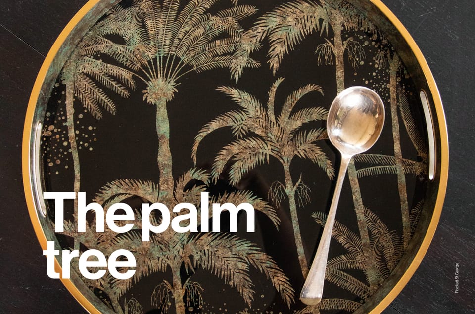
From Art Deco influences to deep green wallpapers and silhouetted gold accents, the palm tree motif shifts from tropical nostalgia to refined elegance.
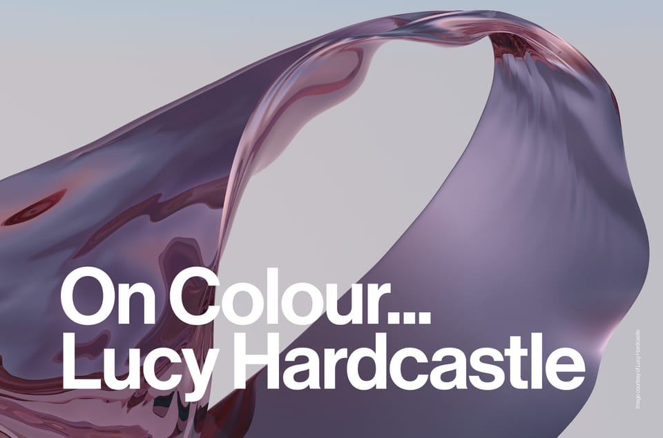
Lucy Hardcastle on colour as a storytelling tool, from subtle gradients to bold digital hues, blending material exploration with sensory experiences.
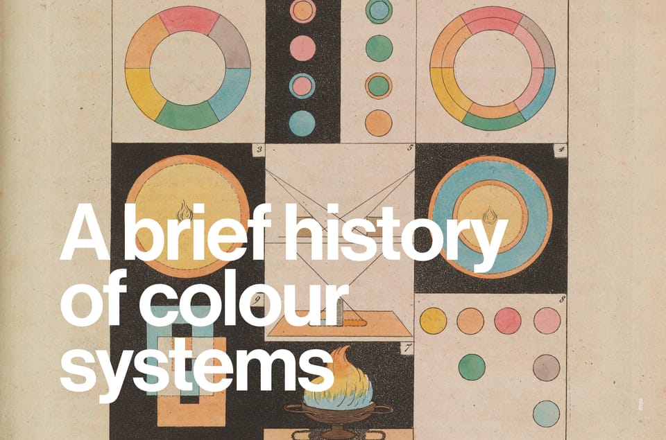
A deep dive into where it all began; a look at the rich and historic path to identifying colour.
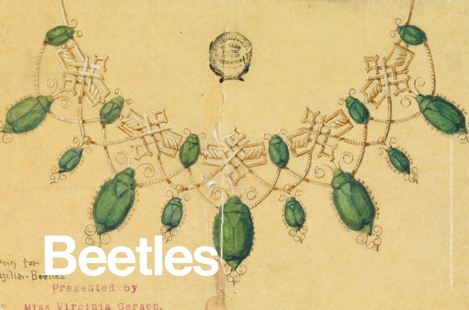
Beetles in design, from Ancient Egyptian symbolism to Victorian embroidery and McQueen couture. Iridescent shells, intricate embellishments and a recurring motif across fashion, interiors and accessories.
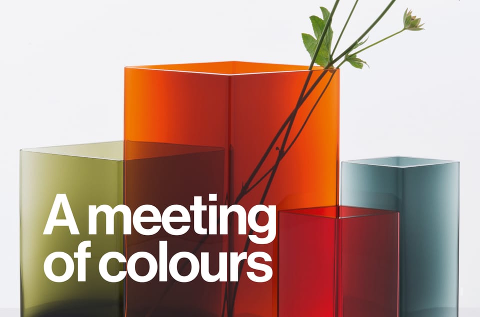
The role that tangible material properties play when layering is a useful tool for creatives to explore the illusion of spatial depth and transparency through colour relationships. In this essay, we discuss how the intermingling of colours can be applied to create layers within design.