
Editorial
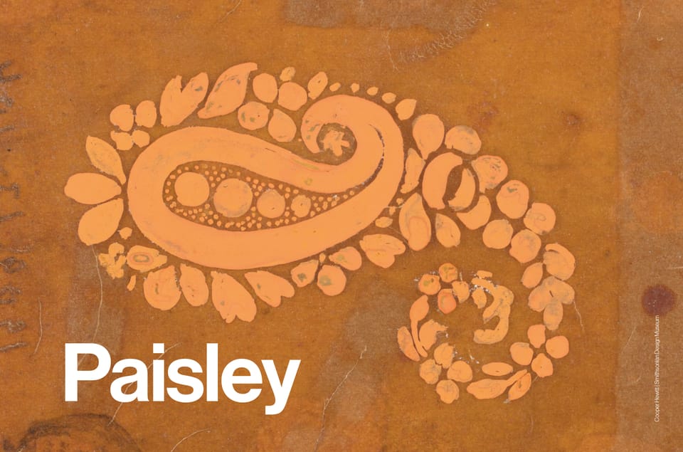
Paisley’s long history, from Persian symbolism to 1960s psychedelia, resurfaces in fashion and interiors. Dior, Gucci and Etro reinterpret the motif, balancing nostalgia with new relevance.
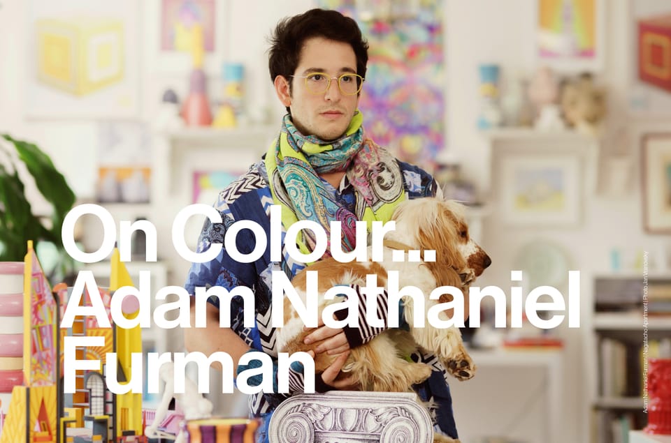
Bold colour, intuitive palettes and influences spanning Japanese aesthetics, Argentine culture and Italian art. Adam Nathaniel Furman’s approach puts colour at the centre of every project.
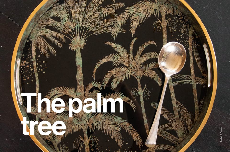
From Art Deco influences to deep green wallpapers and silhouetted gold accents, the palm tree motif shifts from tropical nostalgia to refined elegance.
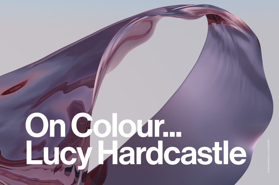
Lucy Hardcastle on colour as a storytelling tool, from subtle gradients to bold digital hues, blending material exploration with sensory experiences.
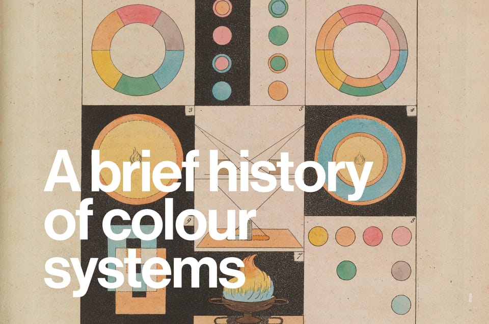
A deep dive into where it all began; a look at the rich and historic path to identifying colour.
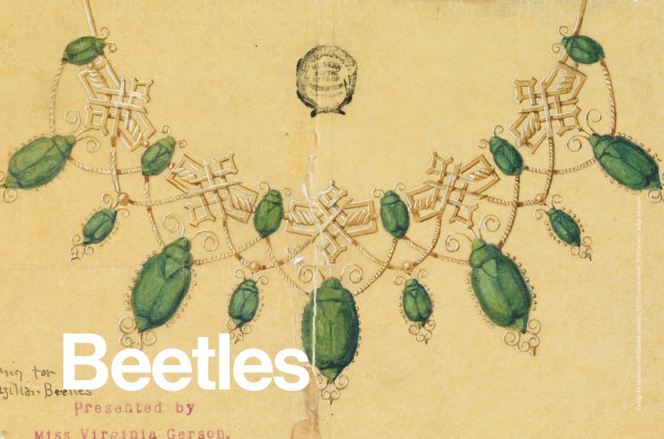
Beetles in design, from Ancient Egyptian symbolism to Victorian embroidery and McQueen couture. Iridescent shells, intricate embellishments and a recurring motif across fashion, interiors and accessories.
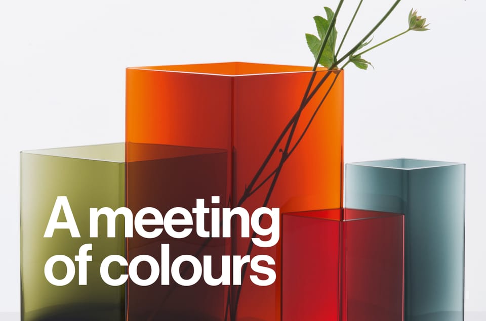
The role that tangible material properties play when layering is a useful tool for creatives to explore the illusion of spatial depth and transparency through colour relationships. In this essay, we discuss how the intermingling of colours can be applied to create layers within design.
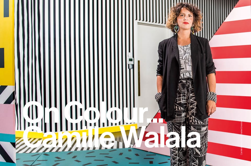
Camille Walala on evolving colour palettes, from bold public art to softer tones for wellbeing spaces.
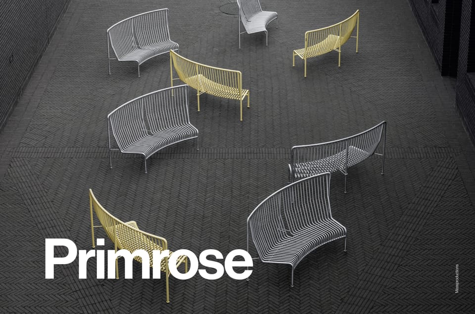
Pale and pretty, it’s easy to dismiss primrose as inoffensive but uninspiring. However this pale neutral can be just as dynamic as more obvious, saturated shades.