Colour Origins
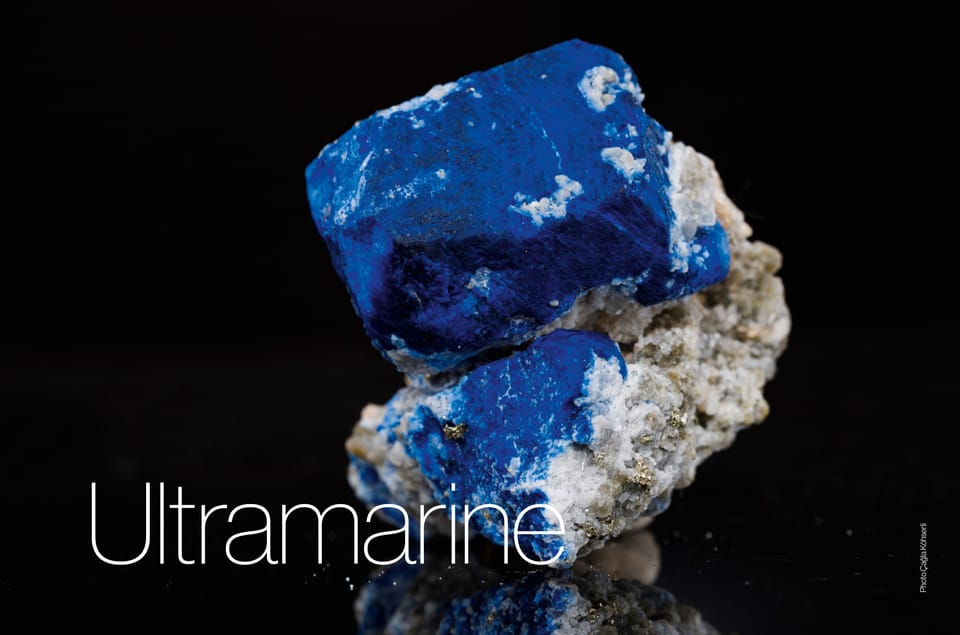
Made from a mineral mined as early as the 7th millennium BC, then employed as an indicator of wealth and status in Renaissance art, Ultramarine was once valued higher than gold.
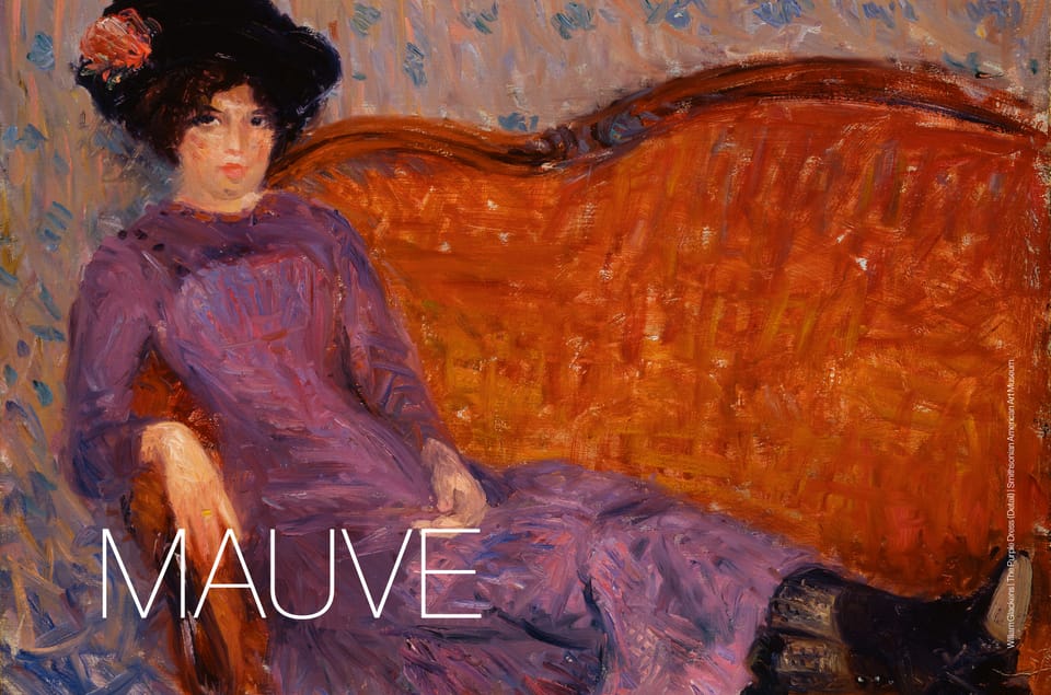
From failed chemistry experiment to the giddy heights of Victorian fashion, flirtations with royalty and camp, and now a role in colouring the Metaverse, mauve is a colour with a rich and often surprising history.
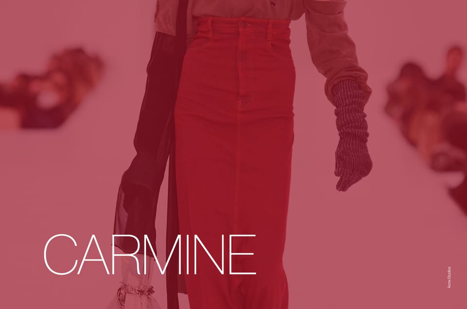
Velvety and rich, Carmine has a chameleon-like quality, strong and opulent enough to make a statement but with just enough subtlety to play a supporting role in current and future palettes.
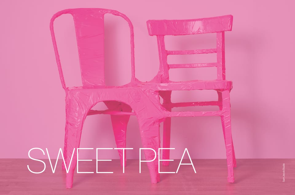
Sometimes consumers just want a little bit of unabashed prettiness and this sugary confection of a pink more than delivers. Yet, alongside its reputation for slightly retrograde sweetness, this colour can also prove surprisingly anarchic.
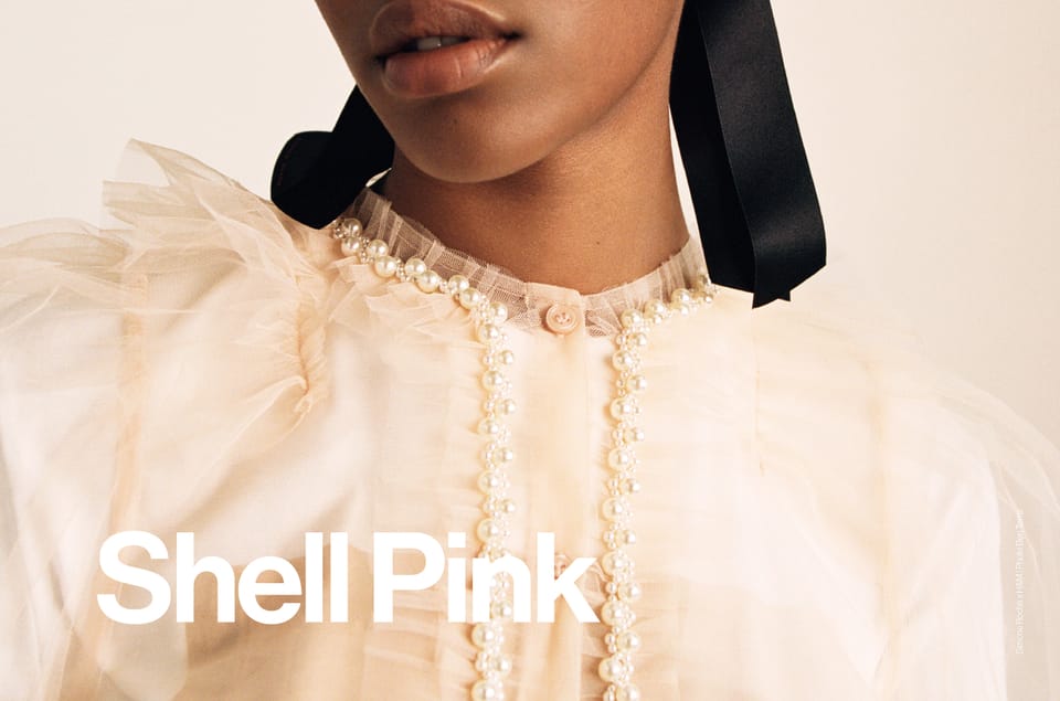
Previous iterations of Shell Pink have grouped it in similar tonal pairings, earning this colour an underserved reputation as a safe if uninspiring choice. Now though, designers are subverting previous associations, developing a new edginess to previous prettiness.

Pale and pretty, it’s easy to dismiss primrose as inoffensive but uninspiring. However this pale neutral can be just as dynamic as more obvious, saturated shades.

Named after the tannum or oak bark used to tan leather, this orange cast colour has an undeniably retro 70’s spirit but there’s a slightly futuristic feel at play too.
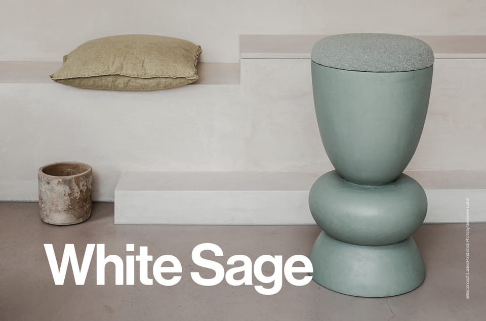
White Sage is something of a delicate wallflower. Yet, while this de-saturated eau de nil whispers so softly it can barely be heard, its appeal is broad and its versatility strong.

